- Using the
mtcars data, create a barchart of the counts for each level of cylinder.
- Repeat the barchart but stack the counts by gear.
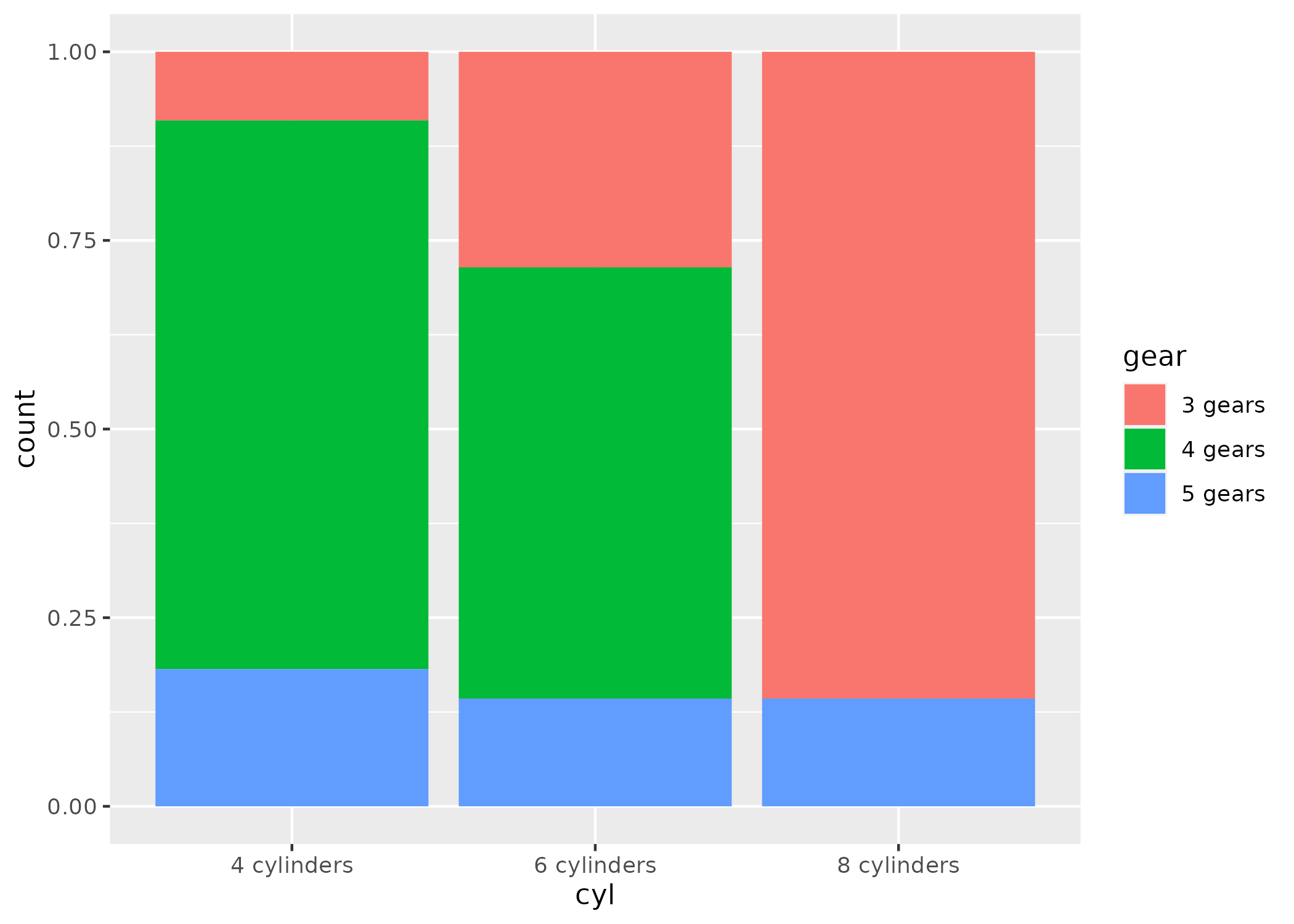
- Recreate this plot:
- Repeat barchart #2 but set the position to “dodge”.
- Whoa, what happened to 8 cylinders? Unfortunately, since there were only two levels of gear for 8 cylinders, it just split the bars in two. To hold the numbers of bars the same across all levels, you can set position to
position_dodge(preserve = "single"). Try that.
- Well, that’s better—the two bars are the same width as all of the other bars. But the 4 gears should show up as 0. To fix, we need to count the data first, find implicitly missing data, and plot using
geom_col(). So first, find counts for the combinations of cylinders and gears. Then use complete() to find the implicitly missing combinations. Then replace the NAs with 0s. Then use geom_col() to plot these values with the position dodged.
- Make a dotplot of the counts for each level of carb and plot carb on the y-axis and the count on the x-axis. Reminder that first you’ll need to count the observations in each level of carb before starting the plot.
- Repeat dotplot #8 but order carb based on the counts from highest to lowest count.